Protected work
This case study is password protected. Enter the password to continue.
Have a copy of my resume? You'll find the password on it.
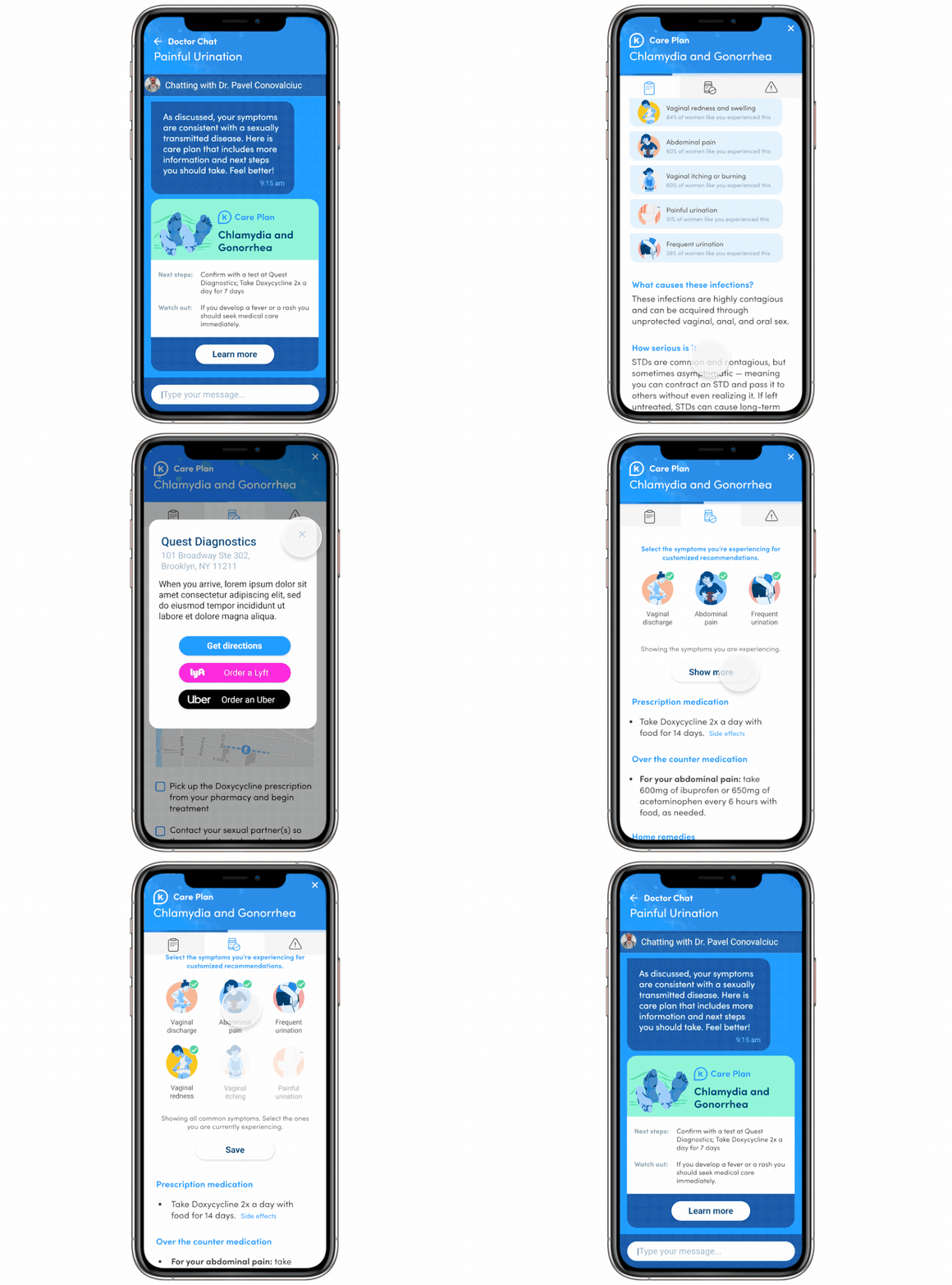
K Health Care Plans
Team: Design Lead (myself), Product Manager, Content Writer, Medical Doctor, Engineers.
K Health employs about 200 physicians as part of their main service layer: texting with a doctor. Physicians have to strike a balance between efficiency and attentiveness. Efficiency lets physicians treat more patients in less time, increasing revenue and reducing wait times. Attentiveness drives patient satisfaction and the overall experience. Solving for only one of these priorities often comes at the cost of the other.
Opportunities
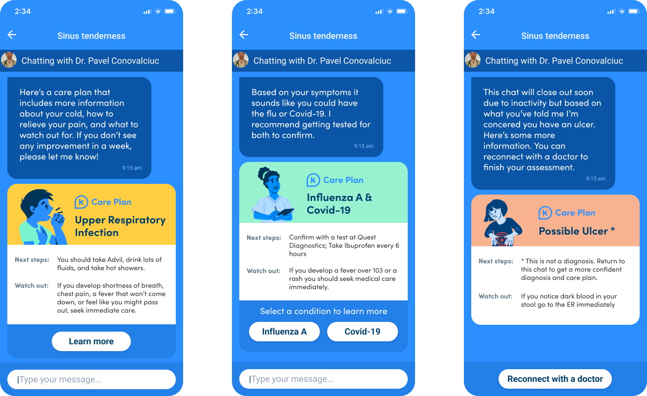
In brainstorming solutions to test, the team stayed focused on outcomes that would help both physician efficiency and patient experience. Linking patients to our website health guides would pull users out of the app, away from the doctor, with no personalization. So we landed on the idea of building dynamic care plans for conditions: a resource physicians could send after a diagnosis that's personal, easily digestible (not a wall of text), and that reduces back-and-forth between patients and physicians.
Increased physician efficiency.
No negative impact to patient satisfaction ratings.
Users spend an average of 1 minute or more engaging with the tool.
Challenges
K Health physicians can diagnose thousands of conditions remotely; building a care plan for every one would take an enormous amount of medical and content effort. Rather than over-invest in something unproven, we started with the 20 most common conditions and planned to grow the library from there.
I also needed a content system that could flex across very different conditions. A common cold is simple; an STD is not. I deliberately started with Chlamydia and Gonorrhea (requiring a lab referral, waiting on results, prescriptions and more), so the most complex edge cases surfaced early and shaped the design.
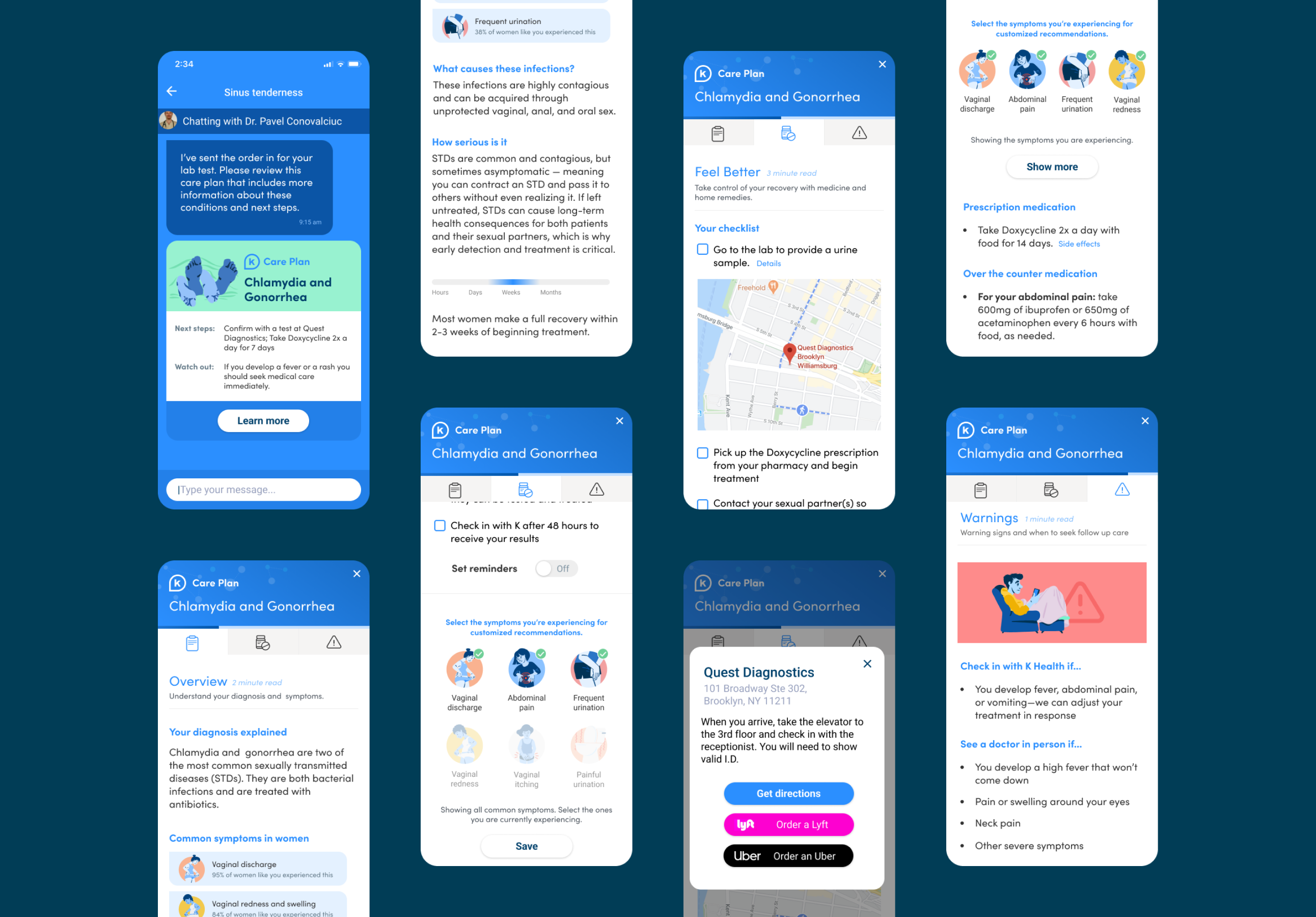
Above all, I wanted to avoid a wall of text. If patients couldn't find what they needed, they'd return to the doctor with more questions, undermining the very efficiency we were after. So every care plan breaks into three clear sections.
Clear headlines with only the most important information, plus supporting images to break up the text, so patients grasp their diagnosis without wading through a wall of content.
Dynamic, actionable guidance: a checklist, lab directions with a map, and prescription details — including interactions that let users order a ride or set reminders right from the plan.
Warning signs and clear thresholds for when to check in with K Health or see a doctor in person, so patients know exactly when to act.
Process
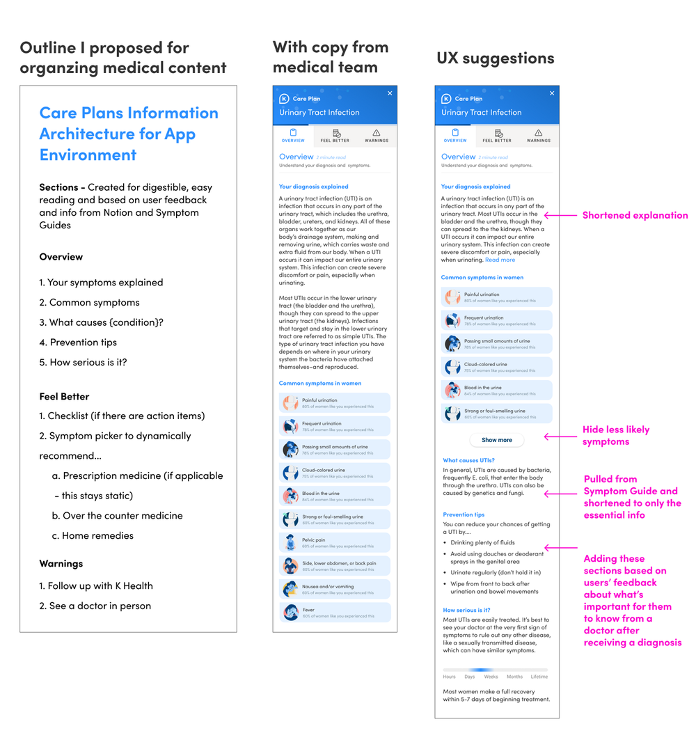
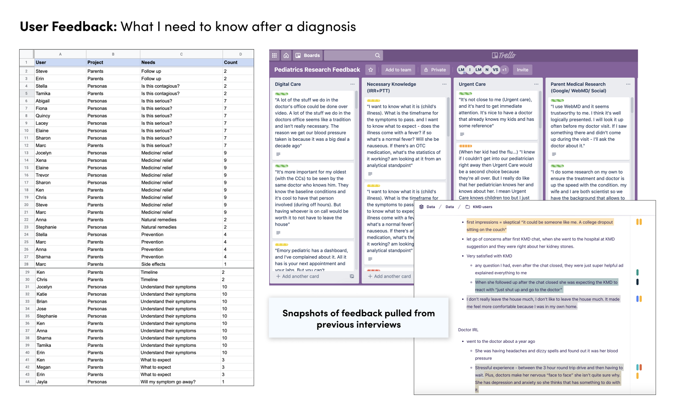
After brainstorming, I wanted to start by understanding user needs. In a perfect world I'd have spent days interviewing users, but budget didn't allow it, so I leveraged feedback from past research sessions that turned out to be highly relevant. Revisiting that documentation, I compiled the most crucial information for users post-diagnosis.
With a clear point of view, I began sketching against both user and business needs. K Health's design system removed a lot of the guesswork and kept engineering handoff smooth. We did introduce one major new component, the tabs, which I got buy-in for by proving the many opportunities for reuse.
Regular check-ins with product and stakeholders kept everyone aligned, where I explained my decisions and applied feedback where appropriate.
Increase in physician efficiency.
Patient satisfaction held steady.
Average time spent engaging with a care plan.
Of users returned to their care plan more than once.