Protected work
This case study is password protected. Enter the password to continue.
Have a copy of my resume? You'll find the password on it.
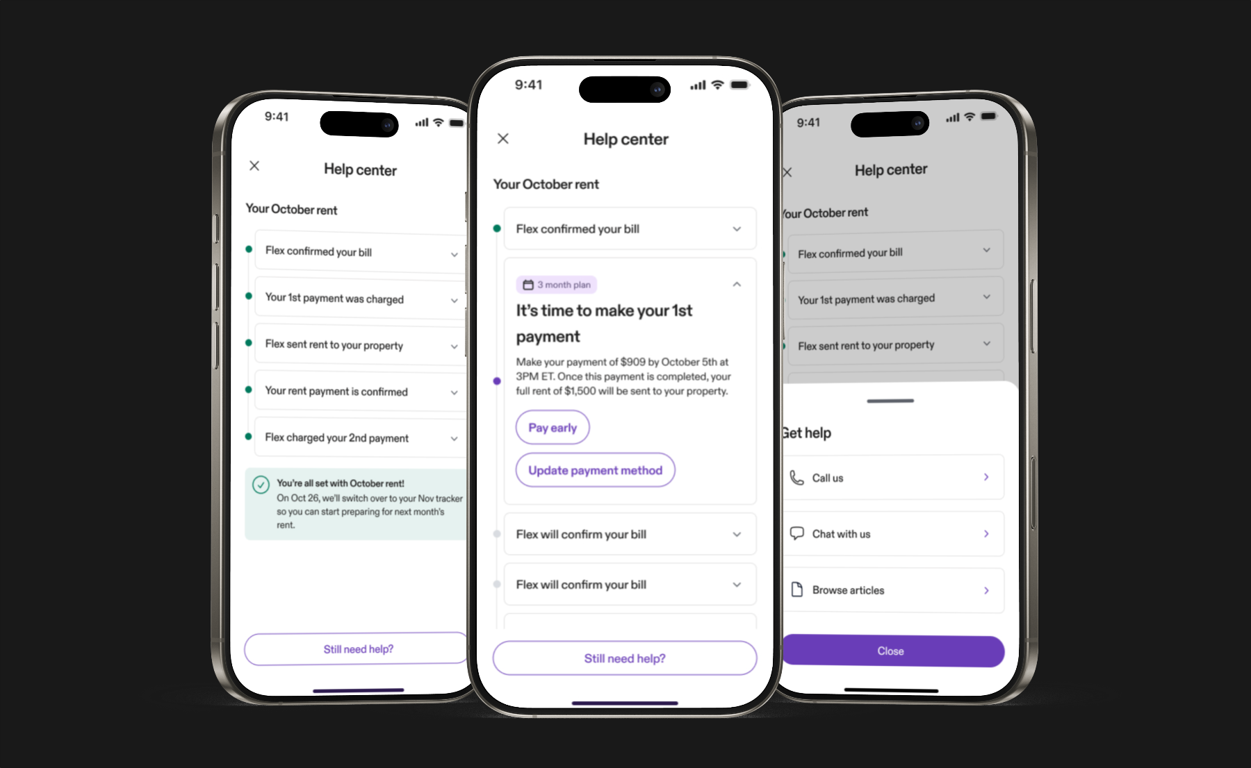
Scaling support through self-service
Team: Lead Product Designer (myself), Product Manager, 2 Full Stack Engineers. Claude served as a research layer, connected to chatbot transcripts and Zendesk ticket data to surface patterns across thousands of user interactions.
I designed the in-app Help Center for Flex Rent, giving renters a self-service path before reaching human support. It shipped across three experiment phases over four months, each expanding to a broader user segment.
Prototypes were built in code using Claude, moving from design decision to testable artifact in hours rather than days.
The prototype is live, try it yourself →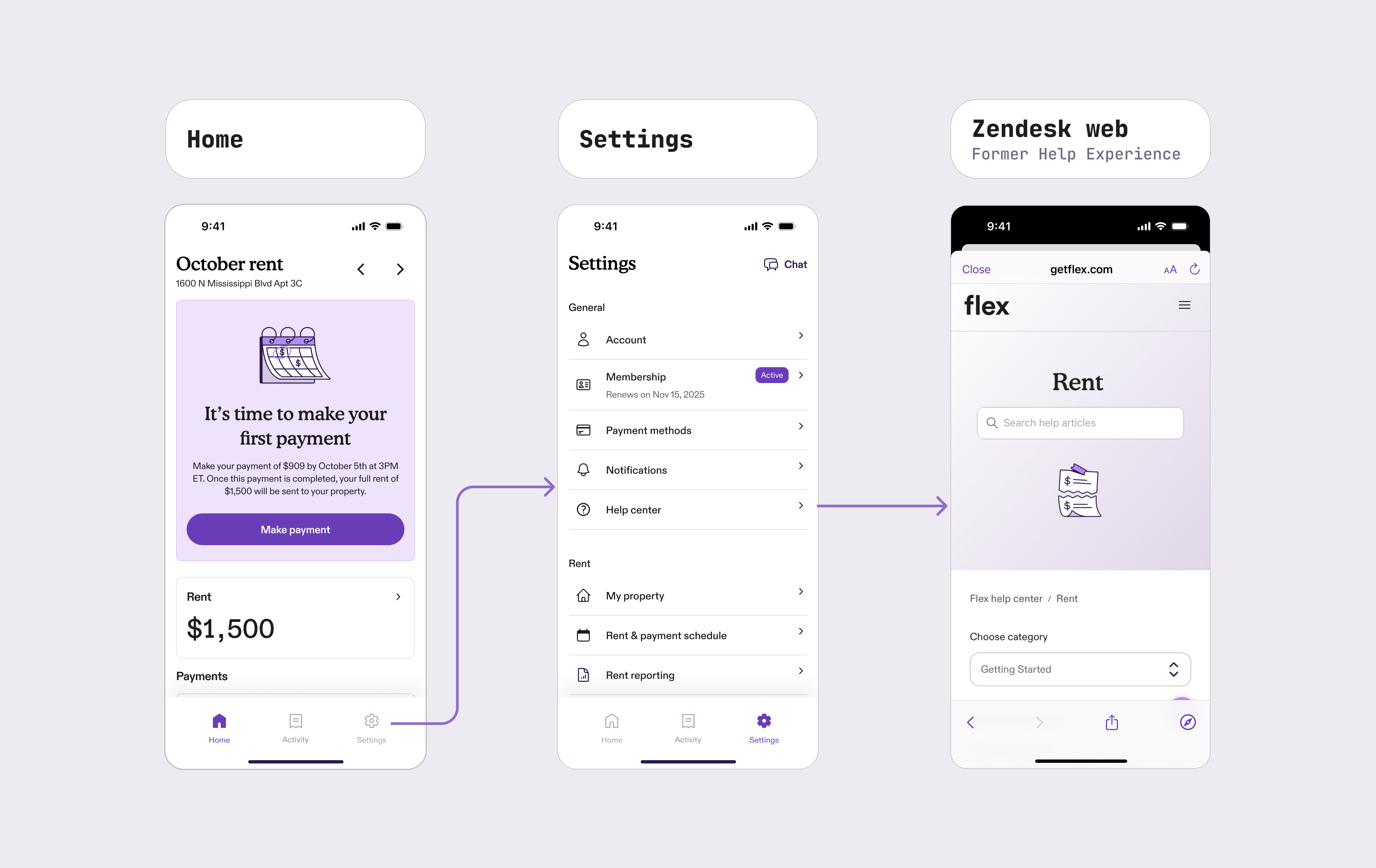
The Help Center hadn't received meaningful product investment. What existed was a Zendesk web view buried in Settings, static articles with no account context and no way to take action. Users who needed help were routed to a chatbot first, at $1.25 per interaction, but it frequently failed to resolve the issue. From there, tickets escalated to a human agent at $20 each.
The opportunity was clear: give users real information about their specific situation and let them act on it, before they ever needed to reach the chatbot.
Three phases, one direction
Each phase shipped to a broader segment, compounding on the last, moving from a static help view to a contextual, action-first experience.
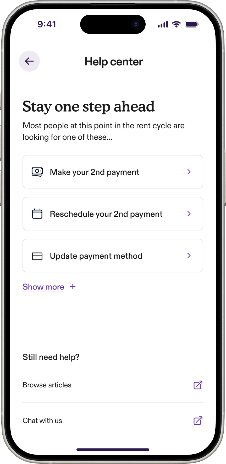
The first version replaced the Zendesk web view with a native experience built around action. Rather than presenting every possible option, the Help Center surfaced a personalized set of calls to action filtered to where each user was in their rent cycle, pulling from a library of 7 common tasks. Deep links handled the routing, keeping engineering lift low while still getting users directly to resolution.
The result was an 8.5% reduction in interaction rate from day one.
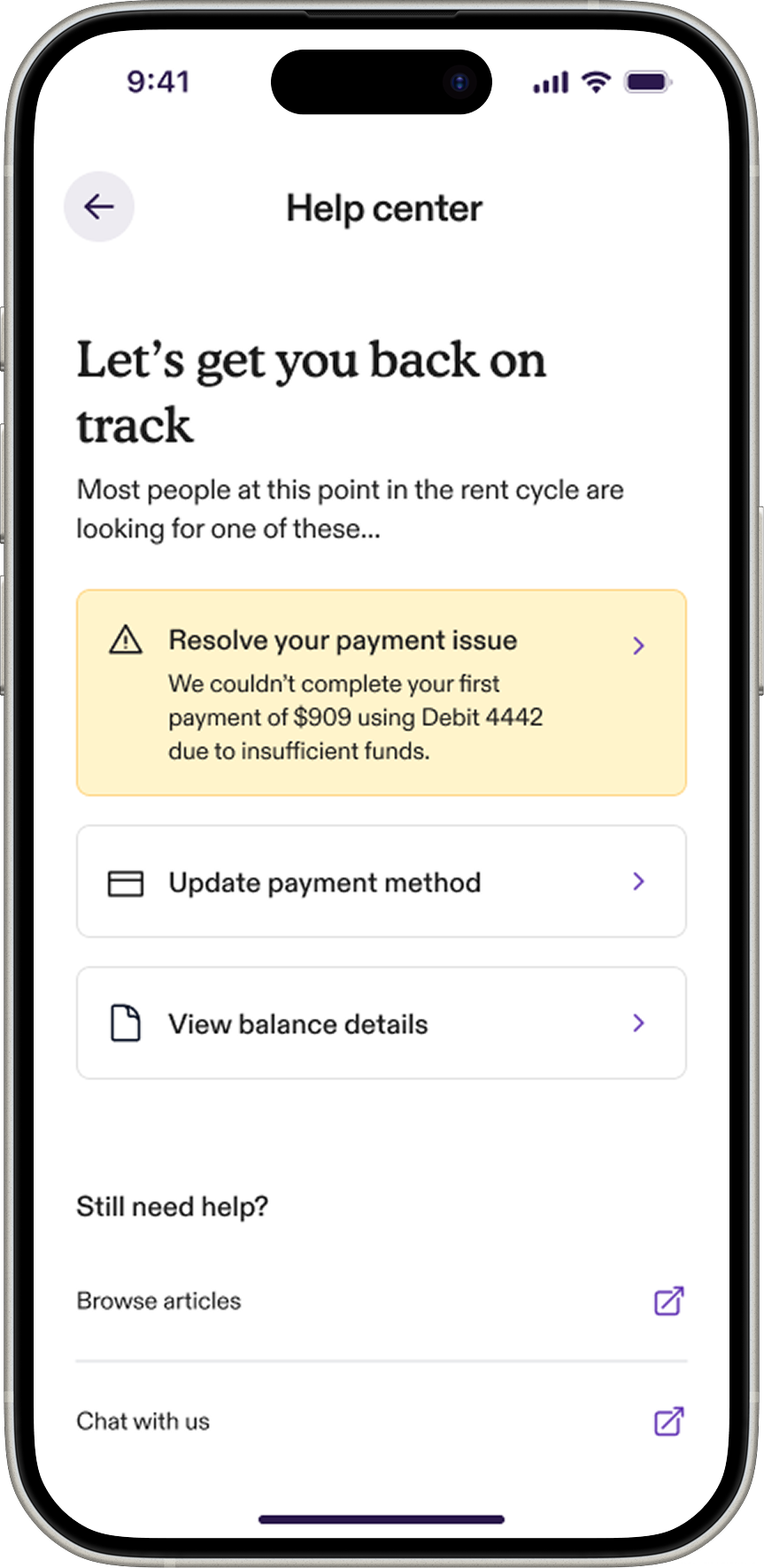
Payment failures and account issues were among the most stressful moments in the rent cycle, and among the most common reasons users contacted support. Phase 2 brought those states into the Help Center proactively, surfacing a brief, plain-language explanation of what went wrong alongside a direct path to fix it.
Users who may have defaulted to contacting support now had a clear first step they could take themselves.
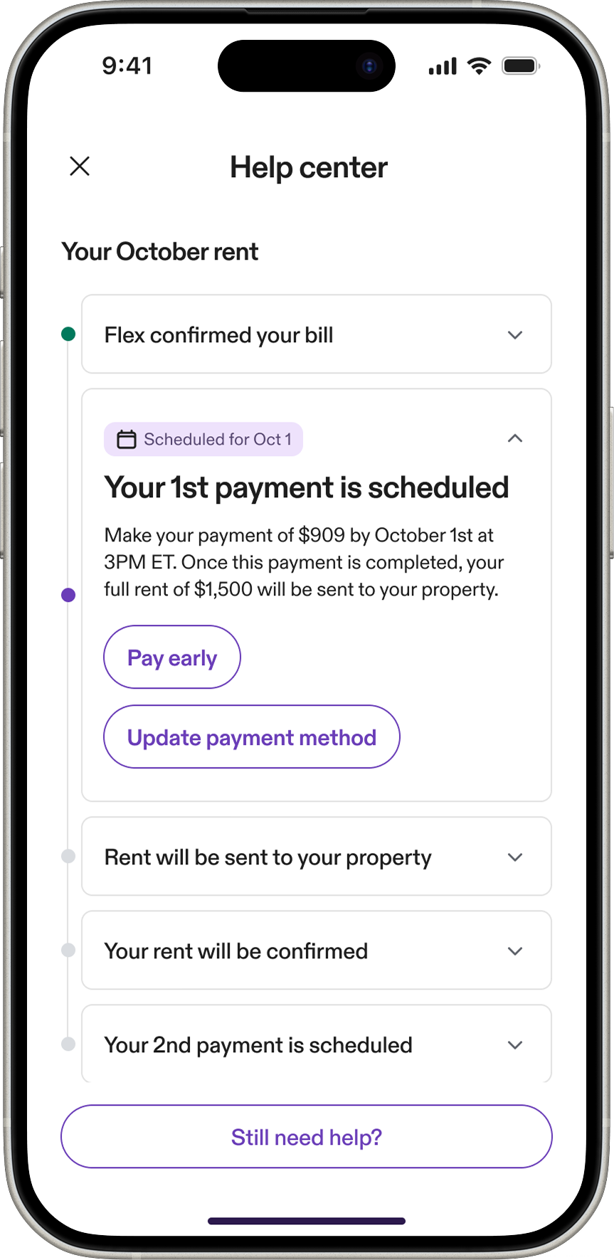
The most common question CS fielded was simple: was my rent paid? The answer was technically visible on the home screen, but stress and confusion meant users often missed it. Phase 3 introduced a detailed rent tracker, each step of the billing cycle as a living timeline. Users could tap into any completed or upcoming state to see exactly where their payment stood and act from within that context. Surfacing the right action at the right moment, rather than a flat list, was the core design decision.
This phase delivered the strongest results: a 9.7% drop in interaction rate and 10.4% reduction in ticket rate.
This project moved unusually fast for its scope, and AI was a big part of why. I used Claude Code to build rapid prototypes for user testing and stakeholder sign-off, and connected our experiment dashboards, chatbot logs, and Zendesk ticket data to Claude to see where users were struggling across thousands of interactions. That synthesis would have taken weeks manually, and it meant I could walk into every design session with a much clearer point of view on what actually needed to be solved.